Lesson 3: Telling Stories with Data Visualizations
The Data Proficiency Program training lessons will arrive monthly in your inbox from mph@subscriptions.in.gov. If you are not receiving the lessons when they are posted via your state email account, you can subscribe to our mailing list to receive the monthly lessons.
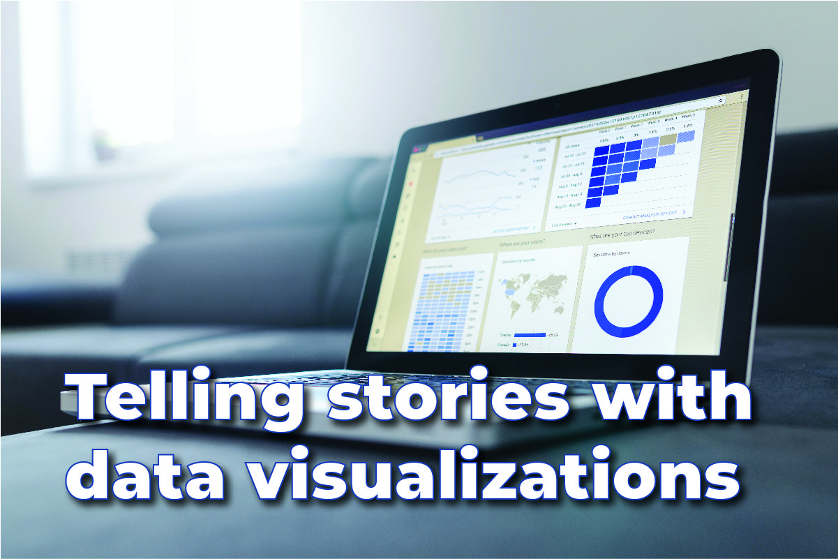
From personal budgets to daily time logs, most people are familiar with spreadsheets that track various data points. When the amount of data becomes overwhelming, charts and graphics, also known as data visualizations, can become helpful in determining the story behind the data.
State agencies, the media, businesses and non-profit organizations all use data visualizations to show the impact and trends data analysis reveals. Here are some of the State of Indiana’s most-visited data visualizations:
- Indiana Department of Health: Coronavirus Dashboard
- Indiana Department of Health: Coronavirus Vaccine Dashboard
- Indiana Career Connections and Talent: 21st Century Talent Regions Data Display
- Next Level Recovery Dashboard
- Auditor of State: Indiana Transparency Portal
Each year, these dashboards have more than 12 million visitors. If you would like to see examples outside of Indiana State Government, visit the examples below.
Extra viewing:
- Rock Content: 6 Best Data Visualization Examples of 2020
- Flowing Data: Best Data Visualization Projects of 2020
Now that you know more about data visualizations, how do you plan to use your skills? Next month’s lesson will focus on data collection.
<< Go back to Lesson Two: Misconceptions in data analysis | Go to Lesson Four - The importance of data collection >>